Dia Media

  • Home
  • Blog

To Tweet or Not to Tweet: Social Media Fatigue

March 9, 2015

Social Media Overwhelm
(with apologies to the master Mr. Schulz)

Or the incessant nagging of social media and how to resist its petulant demands.

A few days ago, the news spread that Google+ is on its last legs, as the G giant re-structures and puts ‘Google’s Photos and Stream products’ on the front burner. I will not miss the product, as my primary interactions were half-hearted attempts to engage in a space that I couldn’t quite figure out how public it was. FB is clearly for “friends”, Twitter is public (sure you can make it private, but what’s the point?) and G+ was a too many options with confusing circles type of place. I helped set up a number of client’s business pages and that was about the size of it.

And yet even as its passing is widely pronounced there are pundits who are still assured of its G for giant status.

This leads me to let out a big sigh and slump my shoulders.
I’ve developed social media fatigue —keeping up with the tweets— how much to tune in, how much to tune out, this new product, that new app. It’s a jungle out there.

I’ve noticed symptoms of social media fatigue, feeling overwhelmed, anxious or just plain ol’ bored.

When Twitter first came online in 2008, I started to notice all my favourite bloggers using this new platform. It seemed fun , but I held out till 2009;) opening two accounts, one for business one for personal needs.

At first it was always fun. Everyone was so pithy and content so curated I felt like I as at the office water-cooler and the latest greatest conference at the same time. After a while it became a kind of chore. Then, something might happen — this news event, that conference, this conference, and I was hooked in again.

It’s a see saw.

I totally see the value of social media and yet I see its tendency to be a beautiful countryside road overblown with billboards. Yuck.

So what’s a poor girl to do in the face of a behemoth.

  1. Breathe – Dr.  Andrew Weil recommends the 4-7-8 relaxing breath exercise. Briefly, (because hey you’re busy:) inhale slowly for 4, hold for 7, and exhale with a whoosh sound for 8.
  2. Focus – How many social media accounts do you really need? Pick one or two accounts to keep active. (unless of course you’re a big company and you have staff handling this for you in which case why are you reading this?) If you must have several accounts, but are truly only active on one, then let your readers where to find you. ie: I have this FB page, but I’m really active on pinterest. Join me there (with link).
  3. Prep – your content – (which is definitely not only about you!) in advance. Articles, fun stuff, etc. And yet remember that timing is relevant. Careful with those pre-tweet strategies when something big is happening in the news and you’re tweeting rainbows and unicorns.
  4. Know – your audience. Which is the same as #2. If you’re speaking to twitter, use #hashtags, @replies, learn the lingo and, again, don’t spew out links to me-me-me every two minutes.
  5. Be Nice – social media makes it so easy to get caught up in the moment in a not such nice way. Bad service at X department store (@BIGbigstore – hey I ……***&&&%%%$$(((!!!) – that’s really noise and isn’t helping you and your brand. (I speak from experience – ahem)  Of course if you’ve got a real complaint and have already tried being nice, go ahead and leverage the social media angle. But try to be polite. (I’m Canadian;)

You can find me on twitter @diamedia or @deanneachong. There’s a whole bunch of other accounts that are wasteland and I’ll follow my own advice soon and update them with where to find me. Soon come. Soon come.


Filed Under: Social Media Tagged With: audience, focus, overwhelm, social media, social media tips, twitter

Time For A Re-Design To Re-Align…

September 30, 2014

FIT

That was my choice for my annual #WordOfTheYear . It’s basically the last quarter of the year, and it’s time to review how the word is fitting in, so to speak:)

The concept behind this*  is that when the New Year begins, rather than make a resolution (or several) that are proverbially doomed to fail come February 1st, you select one word that sums up the tone/intention you want to set for the year. Fit felt right for the usual suspect (wanting to get in better shape etc) and, equally so, to be a gauge word for helping me (or us as company) decide what projects to take on, where to place creative efforts and so on.

So far, it’s been a year whereby a long-standing art project has eaten up a huge amount of time. The app “soft-launch” was just this weekend past (see lulusuite.ca), and as this project comes to an end, other client projects still need tending and cultivating. So the luxury of choosing what projects might be a good fit still feels a bit in the future. That said, part of FIT is to eventually re-design so that our values (aesthetic, business, technical, quirks and quarks…) shine through and attract the right clients and projects that are the best fit for us and the client.

Soon come. Soon come.

======================================

Laundry List of Questions to Consider for a Site Re-design

  1. WHY

    First of all Why do you want / need a re-design?
    You might say, “well, our site is not mobile-responsive (if you know what that means) or it needs to be mobile-friendly”. But perhaps what you really mean, is you are losing customers, because a huge proportion of your visitors (you’re tracking them right?) are on mobile devices, and when they land on your site they can’t read anything, so off they go, to another site.

    Another Why might be that your business has changed in some fundamental way – from services to products, from offering workshops to selling e-books – you get the picture. If the content is so out of date (especially if you can’t edit that content) that it no longer reflects your core business, that’s a fairly compelling Why.

  2. WHAT

    What materials do I need to get ready? Which might include:  New larger, magnificent photographs of us, our products, our zeitgest….
    Photographs do have a higher conversion rate than plain text, which is not to say, copy ain’t crucial. That’s also no doubt on your list.  Copy. Hire a writer. Hire a translator. Hire us.

  3. WHERE

    Which is really still WHY. Can people find your site? Maybe it doesn’t matter. You’re a small business and you only need your site to support those business cards you hand out. Still, wouldn’t it be nice if a local search, using the terms that fit your business, turned up your site in the results?

  4. WHO

    Who are doing this for?
    Who is your target audience? Not just a 18-34 man, or 44-53 woman, or an 81-89 senior. What are their values, their habits, their raison d’etre?

  5. WHEN

    When was the last time your site was updated? 2011? 2007? If it’s been a few years, it probably needs a re-do for reasons like the first – WHY > Answer > Mobile technology has changed they way most of our customers view our website.
    Also – when do you want this to be done. Map out a timeline.

Art is Long, Life Is Short


(Art is Long – Life is Short)

*(inspired by singer/songwriter Christine Kane and others)
Filed Under: General, Process Tagged With: fit, process, redesign, time managment

30 Day Tweet Challenge – #30DaysofMobile

March 21, 2014

Yesterday was the 1st day of Spring. Hooray!
With that I felt the energy of Spring and came up with a mini 30 day challenge – which is to research and find information about all things mobile (smartphone adoption, mobile patterns, mobile web…) and tweet about them, at least one tweet every day for the next 29 days (yesterday counted as Day 1). From stats to marketing insights to scientific research….

Midway I hope to compile a compilation post,  and at the end of the thirty days, a summary of what I’ve learned about the “state of the mobile web in 2014” with a focus on Canada.

Day 1: “Mobile used to be the future of business … used to be a trend. Now it’s the norm.” http://www.entrepreneur.com/article/231832 via @EntMagazine

Day 2: Six in 10 Canadians access the Internet via a mobile device http://cira.ca/factbook/2014/the-canadian-internet.html … #30DaysofMobile

I’m going to use the hashtag #30DaysofMobile. Follow me @diamedia

If you like, tweet me and ask me a question about something mobile and I’ll see if I can find something of interest about it, and I’ll tweet you an answer.

Happy Spring!

Filed Under: Blogorama, Mobile, Social Media Tagged With: 30DaysoFmobile, business, mobile, mobile web, smartphone, statistics, twitter

Death, iPhones and Celebrity

February 5, 2014

Death

RIP Philip Seymour Hoffman. At first it seemed the Super Bowl coverage eclipsed your passing, but no more. You will be well remembered at the awards, I trust.
Your death was  a tragedy. I read a blog post that said your death affects us depending on our circumstances. So though, of course, I barely knew you, you are of a similar generation, and thus every man’s death diminishes me.

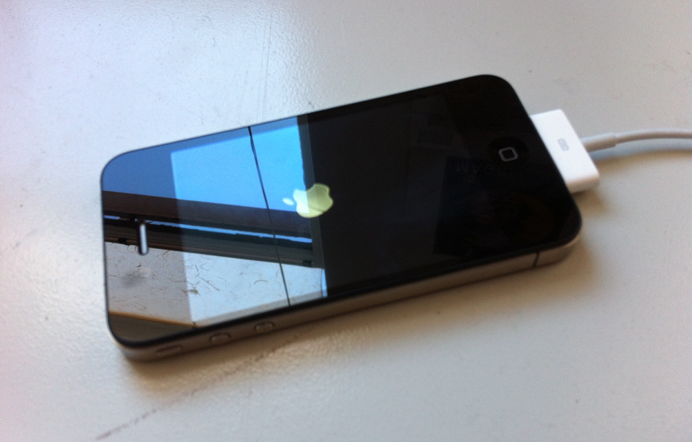
My iPhone 3Gs (yes you read that correctly 3G) is dying a slow prolonged death. First it started with quirky behaviours, and obstinance. It refused to download certain Apps, telling me the OS was too old. Then the alarms would all disappear all at once and I would no longer know what to do with my time. Then it refused to charge. It will still connect to iTunes and so all is backed up. This happened on the same day that PSH died, which is already four days ago, and in terms of iPhone life is surely a ridiculously long time to wait to do something about this death.

I delayed as it came to life on Monday evening and charged to 100%. So Tuesday was a half-day of use. It has not sprung back yet. Hope does spring eternal.

iPhones

At the same time I’m about to beta-test an app I’ve been collaborating on (an art project) and that means I had 3 iPhones (4s) lined up all charging at the same time, showing exactly the same time on the screen. Soon they all merged, like women whose menstrual cycles follow the same schedule and the green bar showed 100% full.

The time was completely in sync as well. Soon everyone will be on the same schedule. Except those few analog hold outs who wear wrist watches, with those long arrow things, I don’t what they’re called.En Guard!

Celebrity

Facebook is 10. Everyone is getting their 15 minutes of fame with those videos. I want to say they are cheesy, but that doesn’t quite encompass the spirit of the thing. Andy Warhol is probably delighted and begging to come back soon embodied as an iPhone 6. Instead of Siri we will hear his delicate timbre dictating where to go and who to hang with.

Decisions

Forced Obsolescence. Obsolescence is a hobby of mine. I did a year long blog (every single day kids) about stuff that was obsolete.

This iPhone 3Gs was obsolete about 2 years ago, but still I held on to it. It worked. Crappy pictures, but I’ve got an obsolete Nikon D5000 for those. Texting was fine. Talking (don’t do much of that). Emails – managed to juggle 5 accounts. Apps – fitness tracking check. financial tracking check. miscellaneous crap to waste time on check.

I also resisted because on our shared business plan, the other phone still has 5 months to go before an upgrade. And here in Canada, it’s only very recently that the switch has gone from 3 to 2 year contracts. Even that seems like too much time.

I like pushing things to their edge. I will repurpose the 3Gs into something. Only the battery is dead.


Filed Under: Blogorama Tagged With: app, celebrity, charging, death, fame, iphone, time

Old Websites – Are They Obsolete or Not?

November 8, 2013

What To Do With Old Websites – Retire or Realign…

A few years ago, a friend of mine announced she might retire as an artist, at the ripe old age of 36. Another friend back East made a similar pronouncement, although he was a few years older than her. Neither have retired, but both took a hiatus. I recently remembered their dramatic statements and started thinking about retirement of a different sort.

For just over 10 years, from 1999-2010 I was very active in the net-art community, producing dozens of art websites. If the lifespan of a website is akin to the doggie years metaphor (1 dog year = 7 human years ), then these sites are seriously out of date.  Last year, in 2012 I created a year-long daily photographic blog [The Obsolescence Project], considering things that were out of date, but I (gasp) used a free wordpress.com site and thus didn’t design the site, so I exclude it from these musings.

Currently I have about six public web projects that are still active online (there are more, but they were produced anonymously, which is another story, so they can choose their own blissful retirement). Almost all of the sites rely partially on Flash, some completely. Flash is basically obsolete. While not technically so, especially where compiled code (as opposed to visible html5 code) is desired, and for games, for projects I’m referring to it is done and dusted. Those sites just aren’t viewable on the iPhone, iPad and who knows where else. So I have to make a decision. Do I retire these sites completely – press delete – and leave documentation (screenshots/text) behind, or is there a way to re-align them with today’s contemporary web standards?

3 Case Studies:

  • pinch
    Screenshot from Excerpts From An Archive

    Excerpts from An Archive, 2001) is partly related to how one searched the web in 2001. Excerpts considers the nature of digital archives, history and fiction. Hand-coded with HTML using tables! At that time I used to get emails from folks asking me for information about their relatives – it was quite touching. The site only uses a wee bit of Flash, so it still hangs together. But it’s not mobile-responsive, it’s looks quite small – in those days you had to be quite conservative with images, dial-up internet might have even still be around, can’t remember.

  • Translations/Traductions
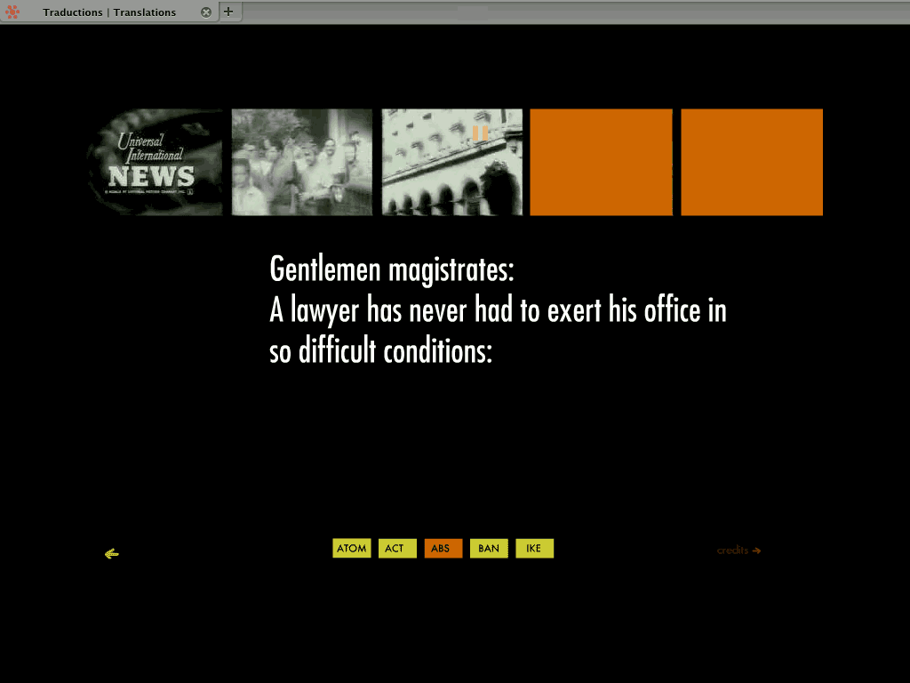
    Screen Shot of Translations/Traductions: L’Historia Mi Absolvera

    Translations/Traductions – produced as a result of a residency at La Chambre Blanche in Quebec City, a series of Flash vignettes created from open source archival movies and texts. Texts translated in google, imagery ‘translated’ (vectorized) in Flash. Blend of interactive and non-interactive animations. 2007 launch date. This one is all Flash – hence invisible on many (read Apple) mobile platforms (including the iPad).

  • Screen shot of Bird
    Screen shot of Bird

    Bird (2004) – A petit homage to Dizzy Gillespie + Charlie Bird Parker. This one is all Flash too. Looking back, I have a fondness for the effort that it took to create. The excerpt from the song repeats and the archival video that has been modified shifts each time. Does nostalgia merit a redesign?

STATUS PLAN

Excerpts from An Archive – This site gets a lot of traction. It has been featured in two books, one grad thesis, and various festivals. It merits a re-design/re-alignment to bring it up to speed. However, some of the little nifty (in 2001 terms) features that were part of it will just have to be lost. This also means a loss (which is already there) of some of the internal logic. C’est la vie.

Translations/Traductions: There are five animations which each are their own story. I still like them.
The non-interactive ones I will look at converting to video. The interactive ones, like the one I featured will, alas, have to stay as is. I don’t see how html5 can handle it all. Of course, I’m open to suggestion. Put up stills for those who can’t see Flash.

Bird: Given this one is all Flash, but non-interactive, it could easily be reborn as a video. The only loss would be the full scalability that the vector format allows. There would a gain too – in that viewers could pause to actually read the text that scrolls by, I didn’t fully recognize the speed then.

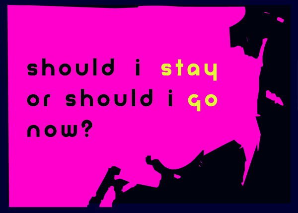
Should I stay or should I go

FINAL THOUGHTS

The three other still live sites I haven’t mentioned are probably going to shift towards documentation only, as their internal logic involved a process of getting input from the public and that process is done.

My rationale for choosing to resuscitate, to whatever degree, these sites has a lot to do with perceived value. Do I still think these works have any value to me as an artist? With the Archives, given that it is still out there, and receives active traffic, it’s not really a question of should, but of when and how.

For TT and Bird, it’s more of a personal reason – ie: I like them, they stay.

For the rest, if I had more time/energy/_______, I might revamp them. But probably it’s best to document, archive and let them gracefully fade away.

If you have old (or ancient) sites that you are wondering if they should be re-purposed for the “mobile web”, here are three questions to ask to help you decide:

  1. Does the site still receive any traffic?
  2. Does it still speak to the heart of your practice/business?
  3. What technologies does it use and how challenging would it be to migrate them?

If the answer to 1 is zero, it’s probably easiest to delete. It’s done, then it’s no longer clutter. Documentation is always a good idea (copy as text, or take screen shots).
If it’s yes, that’s a good hint to bring it up to speed.

If the answer to 2 is no, then I vote for document and delete. Again, why have stuff out there that is attracting people who are interested in content that is obsolete to you.
If it’s yes, that’s probably the most important reason to import it to a new format.

For number 3, technologies: Depending on the type of content, you’re either in for a fairly easy, smooth transition or in for a rocky ride if the content is video in some archaic format and you no longer have the original files (or the original files are no longer readable!) or if it uses Flash animations etc, then the amount of time it will take to re-format creeps up and up. Then you have to ask yourself if you really have the time / money / interest in this thing they call the mobile web.

p.s. Always document.

Filed Under: Techie, Work Tagged With: adaptation, art, change, decisions, digital clutter, Flash, mobile, mobile web, net art, realign, redesign, retirement, technology, time, web design standards, website redesign

Site re-launch

September 4, 2013

Avian Site

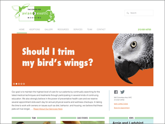
We re-launched The Center For Avian and Exotic Medicine, a speciality veterinary hospital in New York, NY. New features include: replacing most of the pdf forms with online forms, mobile-ready responsive website, re-organization of content to feature their extensive articles and resources. If you have a bearded dragon that needs treatment and you live in NYC, head on over to the CAEM!

Filed Under: Work Tagged With: clients, genesis, mobile, projects, responsive, site design, website design, website launch, wordpress

Fonts and WhatNot

November 25, 2012

Response to Pecha Kucha on Friday night.

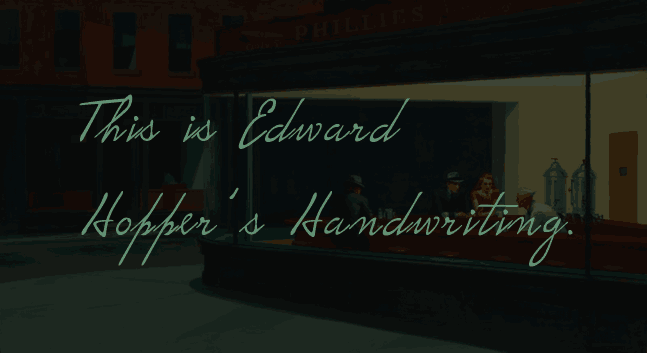
Edward Hopper's handwriting

1. I learned typography is not boring. Which I knew of course, but fun to see it presented historically going back thousands of years.

2. The last speaker closed with a slide that said “Create something”. And in his charming youthful, snowboard culture way, said that it didn’t matter if it was good or bad shit, just do it. The slide reminded me of Corita Kent, an artist and a nun, who had this to say on the matter of creating:

“Nothing is a mistake. There’s no win and no fail, there’s only make.”

Possibly also written by John Cage, but he’s well enough known, so I rather prefer the idea of the her penmanship being the one. Apparently they knew each other, so who knows, it may have been a collaboration.

Filed Under: Process Tagged With: art, corita kent, edward hopper, fonts, mistakes, typography

Email Send Limits – or Why Spammers Should Be ….

November 9, 2012

This week I spent about 8 hours wrestling MailMan to the ground. I got an A in wrestling during my first semester at college, which means I should be good at this, eh?

MailMan is free software for managing electronic mail discussion and e-newsletter lists. I started down the garden path of looking at MailMan for a client was sending out a mass email and bumped into the send mail limit of the hosting provider.

I’m not sure exactly when these limits have been applied or more accurately, strictly enforced, but it seems that they apply pretty much across the board on most web hosts, and even with gmail. The average is about 100 emails per session, or email. We’re talking about number of emails sent from a mail client, if you send from within gmail it’s a higher limit.

MailMan has a lot of features and is pretty decent, all things considered, but as the tech support on the phone told me “it’s not my favourite software”. Mine neither. It feels very dated, like something from the 90s. The 90s were great, but not so elegant.

It seems to me when you are sending through an authenticated account, that you should have a higher limit than 100, but I’m presuming this is the way to keep spammers at bay.

I think I’ve lost a year of my life to dealing with incoming spam, blocking spam, writing SPF records, sifting through junk mail for valid emails, handling comment spam and the like.

There was  a bill passed here in Canada, Apparently the fines are intense, up to $10 million dollars for corporations,  but if it’s had an affect I don’t think anyone’s noticed.

I wonder how many individuals and/or corporations have been fined for sending out spam here in Canada, and what are the stats like for our neighbours in the South? And, when they have been fined, how much was it for, and was the money received?

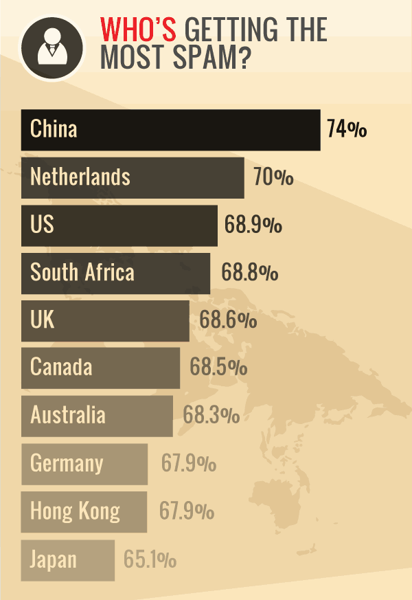
Canadians receive 68.5% of spam.

Source: http://www.emailtray.com/blog/infographic-email-spam-phishing-trends-2011-2012/


Filed Under: Techie Tagged With: anti-spam, mailman, software, spam, time, waste

The diaspora – by nature complex

October 5, 2012

There is a rich, detailed article at MotherBoard “What Happened to the Facebook Killer? It’s Complicated” talking about Diaspora: The Community-run, Distributed Social-network , how the combination of its very low initial  budget ($200,000) compared to Go0gle’s billions, the tragic death of one of its founders, and the scale of reach Facebook had reached, amongst many others, as factors that have influenced its failure to take over FB. The project is still very much alive, however I can tell you in one, ok two, points why it won’t reach millions.

1. Too much focus on geekdom. The Big Bang Theory might be a very popular show, but most folks aren’t interested getting their hands dirty. Who wants to install a server?

2. Too much choice. When you go to the diasporaproject.org and click sign-up it directs you to a tsuanami of pod choices to join. They call it an ecosystem of pods.

I would like a social media system that offers full control over privacy and guarantee of respect of individual and collective privacy. I fully respect the impetus behind Diaspora. And I’m disappointed it hasn’t taken over as a viable new model. Especially in the light of FB’s recent privacy transgressions in Europe. (FB recently rolled out a facial recognition system that tags your photos by automatically suggesting names. They have since suspended facial recognition in Europe – where presumably folks have a longer memory of how data in the wrong hands is no laughing matter.)

But who will provide such a utopic system?

The MB article concludes on an optimistic note: “As the Internet shifts to our pockets and everywhere else, it’s right to be skeptical of those who promise to be the next big thing, no matter how big that thing is. What we do know is that the new new thing is always right around the corner. It probably won’t be Diaspora. And it probably won’t resemble Facebook. But it will probably be better. It will need to be, because it’s our choice after all. These things are nothing without us.”


Filed Under: Blogorama Tagged With: diaspora, new, privacy

Wearing White After Labour Day

September 4, 2012

I have 3 pairs of white pants. One a creamy wide-leg linen pair, one a pair of stretchy  arctic white cropped jeans, and the last is a pair of capris. Also a cool white.

It now being the 4th of September, the fashion goddesses decree I must put these items to rest until next year. But wait, the climes are still in the 20s – and sun is in the forecast. Must I obey?

A friend of mine told me this “Origin of the fashion rule: It had to do with laundry and not with fashion. Back, say 100+ years ago … During the summer months, laundry could be hung outside to dry and sunlight would keep the whites sparkling. But once the cottage was closed and people returned to the city, there wasn’t the same amount of sunshine or the same intensity, and in the city there was a lot of coal smoke and dust in the air (because that’s how things were heated in those days) so whites got dingy very quickly and looked dirty. Hence the dictum: don’t wear white after labor day. Browns and blacks didn’t show the dirt so they could be worn a number of times before they had to be cleaned. ”

So where am I going with this?

Basically thinking about how to redo this website – wrestle it into the ground into something that says stylish, but not too conformist, cool but not arctic and so on. White on a website is like how Picasso referred to black “when in doubt — use black” or so they told me in art school.

Soon there may be more white or a lot less. Rules are made to be broken.


Taken in August."Jeans"


Filed Under: Blogorama Tagged With: design, fashion, rules, white

  • « Previous Page
  • 1
  • 2
  • 3
  • 4
  • Next Page »

Recently

  • Pricing – to Share or Not to Share
  • Comments Off … Radio Silence
  • Why Is It So Challenging To Estimate Time?
  • 2017 Word of The Year
  • End of Year Lists
Create your own visual style... let it be unique for yourself and yet identifiable for others. —Orson Welles

The Vault

  • Home
  • Journal

© 2026 · Dia Media | Website Strategy & Design in Vancouver, BC