Let me count the ways.
Daylight Savings Time has rolled around again, and I’m feeling ranty.
Okay – so I gather some studies suggest that email overlays (a pop-up box that takes over the content, which darkens to help focus on pop up area) are effective in generating more leads.
I’m not a statistician, though I love statistics, so I don’t know how accurate said studies are. What I do know, is what Mark Twain said “Lies, damned lies, and statistics”…
It would seem that pop-up overlays have become a go-to marketing feature on numerous websites, where you want users to subscribe to your newsletter, gather emails, give them a “Free Gift” and so on.
Top irritating factors with pop-up overlays.
-
Le pop-up itself.
Thought these died off years ago.
-
Timing.
If you must use them, are you seriously thinking 1.5 seconds is enough time to “engage” me as a viewer and thus want to subscribe to your newsletter/offer? At least let me read a few sentences, if not a few paragraphs—then you might, perhaps—just perhaps, infer I’m interested and then you can let your pop-up hi-jack my screen.
-
Re-asking for what you already have.
If I’ve clicked on a link from within your e-blast, (which is tracked up the yin-yang by whatever opt-in software you use), why, oh why, must you insist on asking me for my email address again? I’ve seen this way too often. Just stop. It has a repellent effect, not an attracting one.
-
Mobile First!
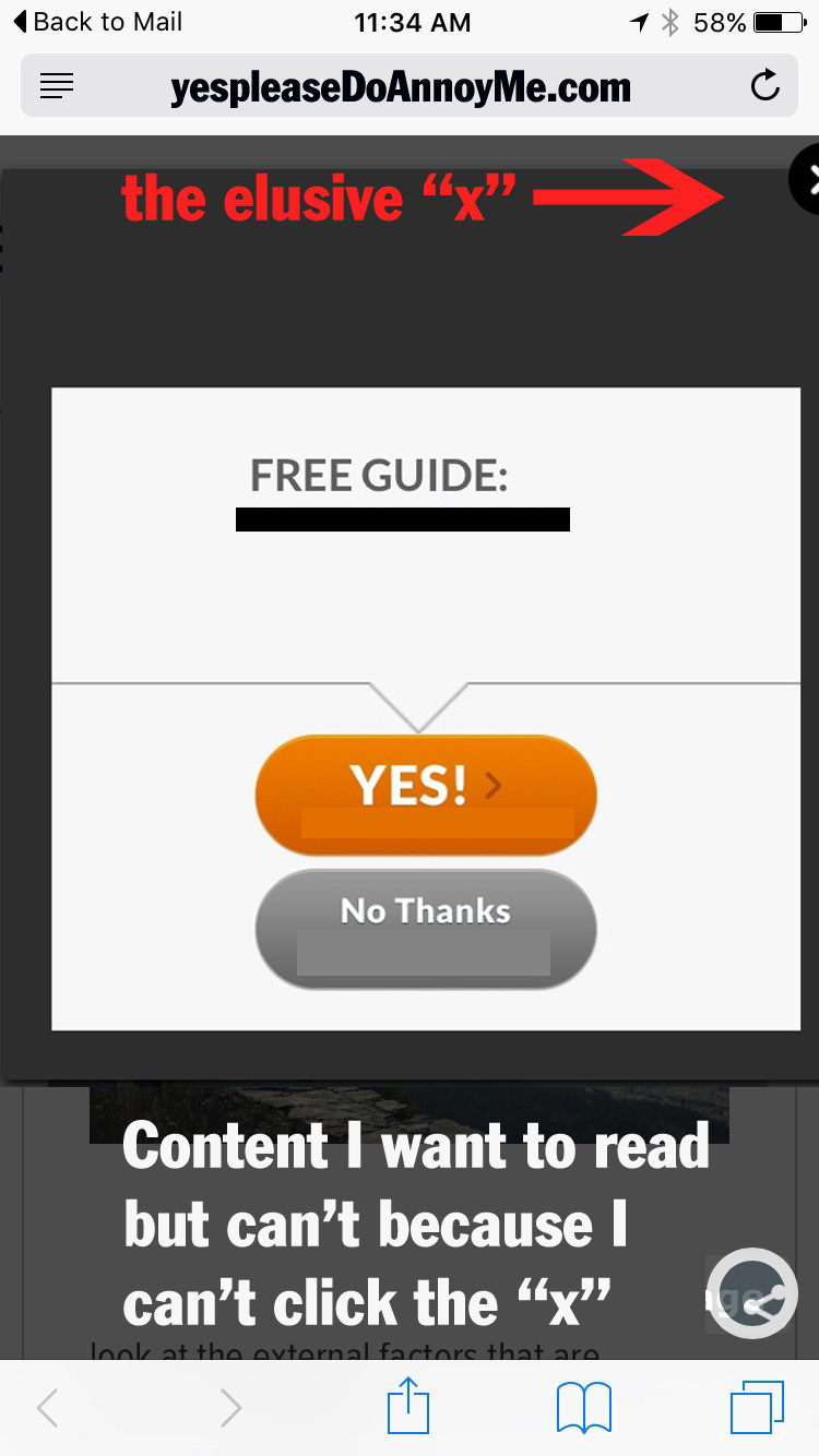
Non mobile-friendly overlays are a sure sign that not only will I go running in the opposite direction, but I will think of you with daggers in my eyes, especially if you are witholding content until I click that “x” in the corner, which if it isn’t mobile friendly, I can’t. So I leave your site, and if you’re lucky I don’t say anything bad about you on ye old social media.
Note, you might think your pop-up is mobile friendly because the fonts shrink down and all seems to behave nicely, but if you leave only the teeniest margin between the overlay and the frame of the smartphone, that little close “x” in the corner is exceedingly difficult to click, and my even with long, slender fingers (ahem) I’m still suffering from fat finger syndrome when it comes to clicking.
-
Lose the Attitude.
If I decide I don’t want to give you my email address (either for the first or the 20th time) or that I’m not interested in your “Free gift” that will magically explode my business, my career, or make my hair really shiny, please don’t insult me with some cutesy, kooky askance negative comment like “No, I really don’t want to grow by business” or “No I really don’t want to succeed” etc. Keep it in your pants.
