Sidebars—
For a while now the design trend has been to kill the sidebar, present your content lean and mean, no distractions and so on.
That is all wonderful if you’re a writer and you’re telling a story, and the viewer only needs to read that one story, then that minimalist approach probably works for you.
But, if you’re in the situation where your blog might also have a more nefarious purpose … having folks opt-in to your newsletter ; offering something for sale, or a deal (horrors); or even the old chestnut – showing your archives and tag cloud (kill that feature – it’s probably obsolete)—then maybe you do need one, particularly if it is converting well for you.
Mobile Caveat —Keep in mind that it will be pushed down to the bottom of the page when viewed on a mobile device . Provided your design is responsive or mobile friendly – if not…what’s the delay?
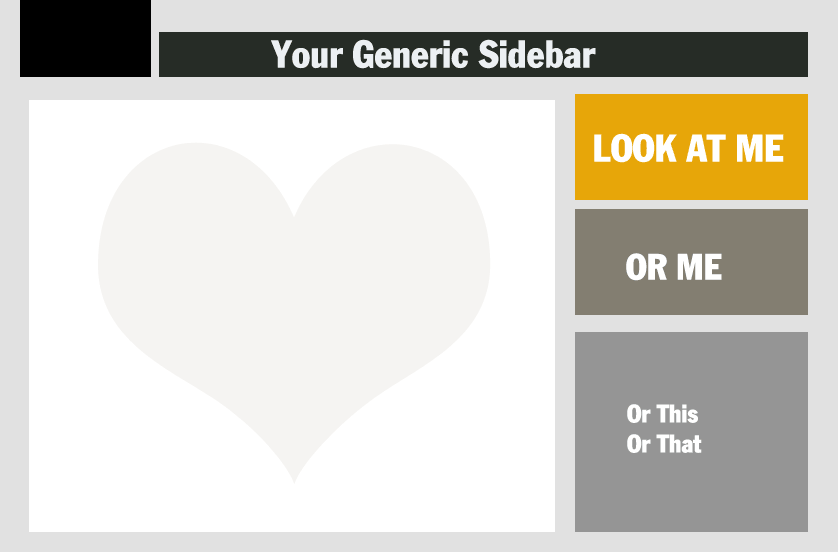
Thoughts on what to keep in the sidebar (if you keep it)
- Opt-in offers. I love this word offers, it makes me think of offerings to the Gods—you are offering up your newsletter, free e-book, something free and shiny, in exchange for capturing their sacred email.
- List of popular posts/recent posts/archives.
- Links to resources.
The 2nd one, the list of posts, would be dependent on where you’re at in your blogging volume and what type of blog you have. Obviously, if fairly new, or (ahem) you don’t have a ton of posts, then popular posts doesn’t apply. If there is a lot of content and I really like the blog, I find it irksome if I can’t easily navigate through the archives, so it’s always nice to see a link to them somewhere.
What to de-clutter from your sidebar
- Still have a default meta log-in widget? (Meta
Log in | Entries | RSSComments|RSS | WordPress.org ) Out the Door It Goes - The tag-cloud
- Video that plays automatically
- Too many images
Use your own judgement about what should stay and what should-go, but it’s a good idea to remember less is usually more. And…
How about an experiment?
- Put different sidebars on different post topics
- Have some topics with no sidebar
- Move the content of your sidebar into the footer
And then track the conversion rate with analytics. And then you’ll know what works for you, which is really what counts.
You may notice we’re not following our basic advice to lead with an opt-in offer on our own (still existing for now) sidebar. Why’s that you say?
Well, in a nutshell, the newsletter, e-book, free monthly nifty calendar design download is on the back-burner as we revise our internal goals. Soon come. Soon come.
