Dia Media

  • Home
  • Blog

Pier D – A Public Art Project

September 27, 2016 by MlleD

007_achong_pierd_verticalweb

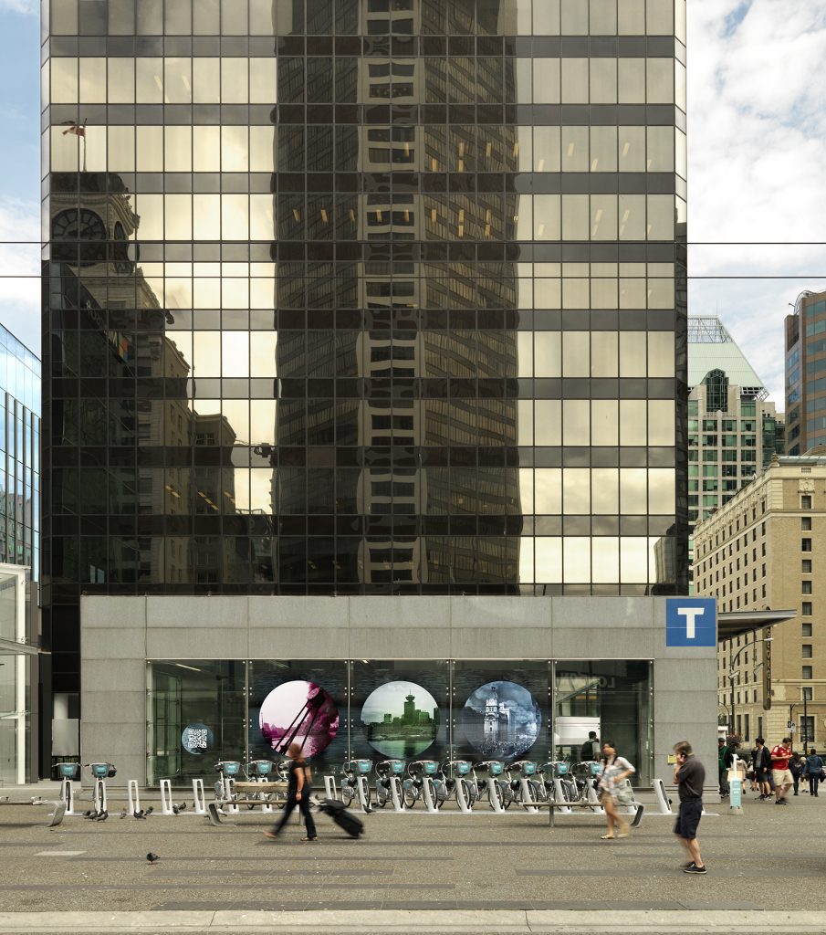
PIER D – A public art project by Deanne Achong (principal at Dia Media). On till the first week in October, 2016, Georgia and Granville Street – Vancouver City Centre skytrain.

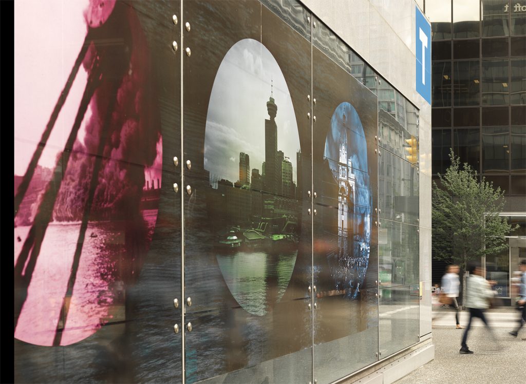
Pier D  looks at a specific historic moment in the life of the city’s port— when, on the afternoon of July 27, 1938, a four alarm fire broke out on CPR’s Pier D in Vancouver, BC. After the fire, the pier was never rebuilt, representing a moment of rupture for the artist. The ‘portholes’ present a central image shot by the artist showing where the pier used to be, book-ended by two altered archival images of the 1938 fire.

Their is a QR code installed in one of the windows, that links to a daily (for the duration of the installation) blog that accompanies the site, matching the dates exactly in a happy coincidence. ie:  September 27th was also a Tuesday in 1938. Some posts are “QR only” meaning they do not get transmitted to the blog and exist in the ephemeral moment of the specific day they were on the QR code.

The artwork is installed at the Canada Line Skytrain Windows on Georgia and Granville Streets from May 16th to October 16, 2016. It is  commissioned by the City of Vancouver’s public art program, as part of their Coastal 25th anniversary project.

More about Pier D project | Pier D QR blog [set in 1938]

004_achong_pierd_viewfromleft_72

Filed Under: Work Tagged With: art, blog, other work, public art

Old Websites – Are They Obsolete or Not?

November 8, 2013 by MzD

What To Do With Old Websites – Retire or Realign…

A few years ago, a friend of mine announced she might retire as an artist, at the ripe old age of 36. Another friend back East made a similar pronouncement, although he was a few years older than her. Neither have retired, but both took a hiatus. I recently remembered their dramatic statements and started thinking about retirement of a different sort.

For just over 10 years, from 1999-2010 I was very active in the net-art community, producing dozens of art websites. If the lifespan of a website is akin to the doggie years metaphor (1 dog year = 7 human years ), then these sites are seriously out of date.  Last year, in 2012 I created a year-long daily photographic blog [The Obsolescence Project], considering things that were out of date, but I (gasp) used a free wordpress.com site and thus didn’t design the site, so I exclude it from these musings.

Currently I have about six public web projects that are still active online (there are more, but they were produced anonymously, which is another story, so they can choose their own blissful retirement). Almost all of the sites rely partially on Flash, some completely. Flash is basically obsolete. While not technically so, especially where compiled code (as opposed to visible html5 code) is desired, and for games, for projects I’m referring to it is done and dusted. Those sites just aren’t viewable on the iPhone, iPad and who knows where else. So I have to make a decision. Do I retire these sites completely – press delete – and leave documentation (screenshots/text) behind, or is there a way to re-align them with today’s contemporary web standards?

3 Case Studies:

  • pinch
    Screenshot from Excerpts From An Archive

    Excerpts from An Archive, 2001) is partly related to how one searched the web in 2001. Excerpts considers the nature of digital archives, history and fiction. Hand-coded with HTML using tables! At that time I used to get emails from folks asking me for information about their relatives – it was quite touching. The site only uses a wee bit of Flash, so it still hangs together. But it’s not mobile-responsive, it’s looks quite small – in those days you had to be quite conservative with images, dial-up internet might have even still be around, can’t remember.

  • Translations/Traductions
    Screen Shot of Translations/Traductions: L’Historia Mi Absolvera

    Translations/Traductions – produced as a result of a residency at La Chambre Blanche in Quebec City, a series of Flash vignettes created from open source archival movies and texts. Texts translated in google, imagery ‘translated’ (vectorized) in Flash. Blend of interactive and non-interactive animations. 2007 launch date. This one is all Flash – hence invisible on many (read Apple) mobile platforms (including the iPad).

  • Screen shot of Bird
    Screen shot of Bird

    Bird (2004) – A petit homage to Dizzy Gillespie + Charlie Bird Parker. This one is all Flash too. Looking back, I have a fondness for the effort that it took to create. The excerpt from the song repeats and the archival video that has been modified shifts each time. Does nostalgia merit a redesign?

STATUS PLAN

Excerpts from An Archive – This site gets a lot of traction. It has been featured in two books, one grad thesis, and various festivals. It merits a re-design/re-alignment to bring it up to speed. However, some of the little nifty (in 2001 terms) features that were part of it will just have to be lost. This also means a loss (which is already there) of some of the internal logic. C’est la vie.

Translations/Traductions: There are five animations which each are their own story. I still like them.
The non-interactive ones I will look at converting to video. The interactive ones, like the one I featured will, alas, have to stay as is. I don’t see how html5 can handle it all. Of course, I’m open to suggestion. Put up stills for those who can’t see Flash.

Bird: Given this one is all Flash, but non-interactive, it could easily be reborn as a video. The only loss would be the full scalability that the vector format allows. There would a gain too – in that viewers could pause to actually read the text that scrolls by, I didn’t fully recognize the speed then.

Should I stay or should I go

FINAL THOUGHTS

The three other still live sites I haven’t mentioned are probably going to shift towards documentation only, as their internal logic involved a process of getting input from the public and that process is done.

My rationale for choosing to resuscitate, to whatever degree, these sites has a lot to do with perceived value. Do I still think these works have any value to me as an artist? With the Archives, given that it is still out there, and receives active traffic, it’s not really a question of should, but of when and how.

For TT and Bird, it’s more of a personal reason – ie: I like them, they stay.

For the rest, if I had more time/energy/_______, I might revamp them. But probably it’s best to document, archive and let them gracefully fade away.

If you have old (or ancient) sites that you are wondering if they should be re-purposed for the “mobile web”, here are three questions to ask to help you decide:

  1. Does the site still receive any traffic?
  2. Does it still speak to the heart of your practice/business?
  3. What technologies does it use and how challenging would it be to migrate them?

If the answer to 1 is zero, it’s probably easiest to delete. It’s done, then it’s no longer clutter. Documentation is always a good idea (copy as text, or take screen shots).
If it’s yes, that’s a good hint to bring it up to speed.

If the answer to 2 is no, then I vote for document and delete. Again, why have stuff out there that is attracting people who are interested in content that is obsolete to you.
If it’s yes, that’s probably the most important reason to import it to a new format.

For number 3, technologies: Depending on the type of content, you’re either in for a fairly easy, smooth transition or in for a rocky ride if the content is video in some archaic format and you no longer have the original files (or the original files are no longer readable!) or if it uses Flash animations etc, then the amount of time it will take to re-format creeps up and up. Then you have to ask yourself if you really have the time / money / interest in this thing they call the mobile web.

p.s. Always document.

Filed Under: Techie, Work Tagged With: adaptation, art, change, decisions, digital clutter, Flash, mobile, mobile web, net art, realign, redesign, retirement, technology, time, web design standards, website redesign

Fonts and WhatNot

November 25, 2012 by MzD

Response to Pecha Kucha on Friday night.

Edward Hopper's handwriting

1. I learned typography is not boring. Which I knew of course, but fun to see it presented historically going back thousands of years.

2. The last speaker closed with a slide that said “Create something”. And in his charming youthful, snowboard culture way, said that it didn’t matter if it was good or bad shit, just do it. The slide reminded me of Corita Kent, an artist and a nun, who had this to say on the matter of creating:

“Nothing is a mistake. There’s no win and no fail, there’s only make.”

Possibly also written by John Cage, but he’s well enough known, so I rather prefer the idea of the her penmanship being the one. Apparently they knew each other, so who knows, it may have been a collaboration.

Filed Under: Process Tagged With: art, corita kent, edward hopper, fonts, mistakes, typography

Project Obso – new blog

February 8, 2012 by MzD

I’ve started a 30(+) day blog about obsolescence. Visit The Obsolescence Project>


Filed Under: Work Tagged With: art, art blog, blogging, obsolescence, photo blog, photography

Edward Hopper and Josephine

January 14, 2012 by MzD

I enjoyed Edward Hopper’s work quite a bit as an undergraduate in art school. Who doesn’t like the moody, dark, impenetrable scenes he pictured of America’s depression and it’s aftermath? Especially when you’re 22.

“New York Movie” - 1939

Don’t get me wrong. I still love his work – his use of colour in particular. He knew how to paint light. What I didn’t know was his wife’s name was Josephine, and that she was also a painter. Amazing what tidbits an education leaves out. How did I come to know about her?

Fonts.  Yep. While trying to come about with something different (yet quick) for the front page of this much neglected site (the old adage about the shoemaker’s son and no shoes) I thought I’d just dig into the font collection I acquired a few years ago. And right there below Hopper > Edward, was Hopper > Josephine.

According to the wiki, her work Jo’s watercolor Movie Theater—Gloucester influenced Edward’s interest in theatres. A quick (is there any other type) google search did not produce any images, sadly.

Filed Under: Work Tagged With: about, art, fonts, hopper

Are you mobile friendly?

Recently

  • Pricing – to Share or Not to Share
  • Comments Off … Radio Silence
  • Why Is It So Challenging To Estimate Time?
  • 2017 Word of The Year
  • End of Year Lists
Create your own visual style... let it be unique for yourself and yet identifiable for others. —Orson Welles

The Vault

  • Home
  • Journal

© 2025 · Dia Media | Website Strategy & Design in Vancouver, BC