Dia Media

  • Home
  • Blog

Why Is It So Challenging To Estimate Time?

February 20, 2017 by MlleD

I mean specifically time as it relates to tech activities. Maybe it takes longer than you think it will to buy groceries, or fill out your taxes:), or even go for a run. But it definitely almost always takes at least twice as long as you think when it comes to anything that touches tech.

Why is it so hard to estimate time?
Is it some kind of optimism bias I wonder?

Scenario: It’s just a minor upgrade.

Oh Sure, I can do that is, say  ~4 hours.

Tick.
12 hours later, a widget that used to work doesn’t work anymore because it’s no longer compliant with the upgraded piece of code that, oh yeah, had to be updated as soon as you logged in. Your shoulders have started complaining. Really they are shouting. Stop. But there’s just one more little thing you can try.

48 more minutes go by.

Productivity Measures, Techniques, Hacks…

I try them all.

My favourite is the pomodoro technique – this is roughly the 80/20 rule. (ie: you only wear 20% of what’s in your closet). So you put a timer on for 25 minutes and work without distraction and then put a timer for 5 minutes and take a break — do jumping jacks, breathe deeply, drink water, check emails…

Oh wait 18 minutes went by.

Ok, no that technique does tend to work. I find it’s perfect when you have a specific list of tasks that are executable. ie: All (ha ha) that needs to be done is

    • a – Add this bit of content
    • b – Change the background image(s) here and there
    • c – Re-style all the headings….

When the elusive flow is required… for creative stuff, for  troubleshooting problems, for composing just that oh so quintessential email whose job it is to attract/repel/impress/tell them to buzz off whoever it is;  I find the buzzer going off at 25 minutes breaks the flow, even though it does help with that shoulder problem. For those types of tasks, it’s better to get a whole heap of it done and then go for a walk.

Being Realistic About Priorities

I think it was Merlin Mann (mr inbox zero) who said, you can only have one priority at a time.
I’m paraphrasing him — If you’re not sure what a priority is, then notice what happens when you’re attempting to juggle a few tasks at once, and your kid or loved one cries out because they slipped. Even imagining the best case scenario and there’s only hurt feelings at stake, you probably dropped everything you were doing and ran to the rescue.
That’s a priority.

I love lists. I try (yes Yoda I hear you) to keep it to 3 major goals (aka priorities) per day. Those goals have tasks attached and I love it when they all get crossed out. If they don’t they move onto the next day’s goals. And generally on Mondays and Fridays, that’s aok. The rest of the week, those carried over tasks – grrrr:)

I’m a recovering perfectionist. I have a spreadsheet I created to keep track of time. Of course, there’s an app for that. I used to use iBiz but they moved on to greener pastures, and the idea of putting my time and tasks out in the cloud caused me to object internally, thus forcing me to edit spreadsheet formulas to come up with what I want. It has colour-coded graphs and everything so I’m happy.

But whilst it might tell me I spent 6 more hours on that client project than I estimated, it doesn’t tell me that in advance. I can see why though. Essentially I generalized and lumped into one task what really should have been broken out into a series of tasks and then I would know that even firing up all the various software, files and notes already takes up 15(!) minutes.


So, yeah, if you’re still reading, sorry to disappoint. There’s no perfect formula. All I can say is that it’s probably best to double, triple or quadruple right off the bat how long you think something tech related will take and then if it only takes 1/4 of that time, you’re both pleasantly surprised, and maybe you even made a , gasp, profit.

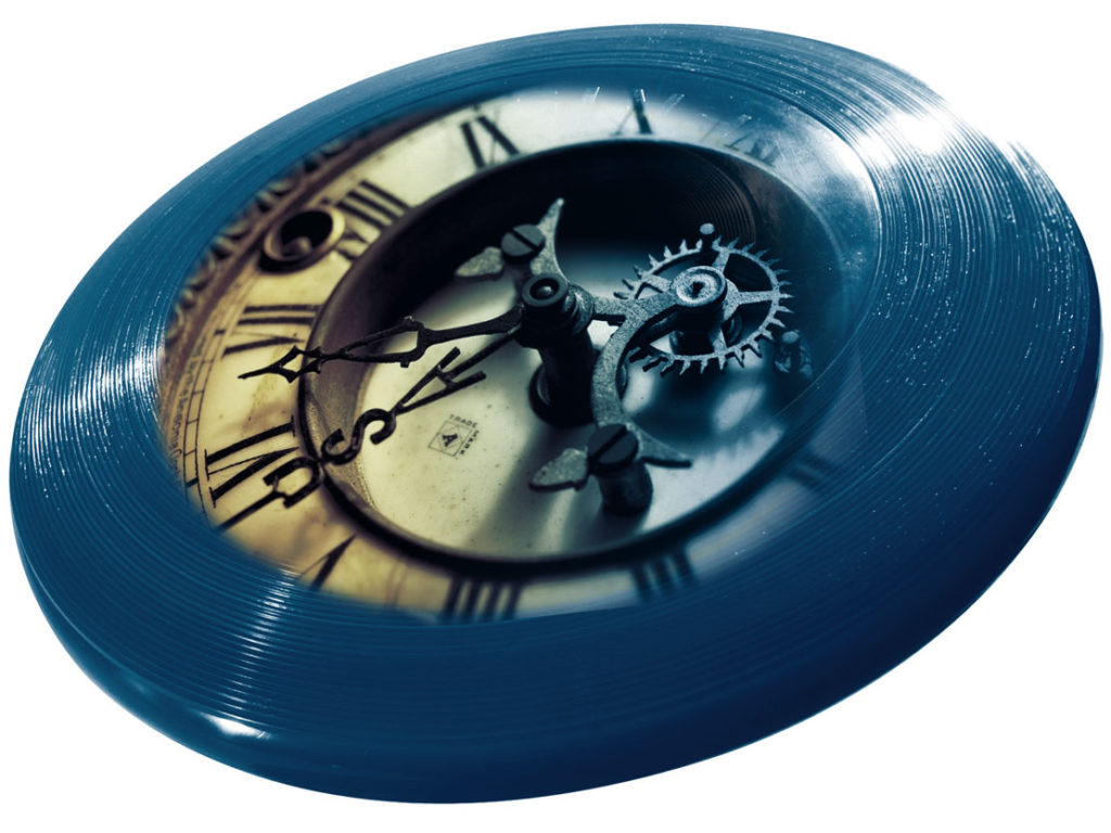
Then you can go for a walk and throw a frisbee, cause, you know, your shoulders don’t hurt.


Filed Under: Techie Tagged With: cost, estimates, perfectionism, productivty, time, time management

To Sidebar or Not To Sidebar?

November 18, 2015 by MzD

Sidebars—

For a while now the design trend has been to kill the sidebar, present your content lean and mean, no distractions and so on.

That is all wonderful if you’re a writer and you’re telling a story, and the viewer only needs to read that one story, then that minimalist approach probably works for you.

But, if you’re in the situation where your blog might also have a more nefarious purpose … having folks opt-in to your newsletter ; offering something for sale, or a deal (horrors); or even the old chestnut – showing your archives and tag cloud (kill that feature – it’s probably obsolete)—then maybe you do need one, particularly if it is converting well for you.

Mobile Caveat —Keep in mind that it will be pushed down to the bottom of the page when viewed on a mobile device . Provided your design is responsive or mobile friendly – if not…what’s the delay?

Thoughts on what to keep in the sidebar (if you keep it)

  1. Opt-in offers. I love this word offers, it makes me think of offerings to the Gods—you are offering up  your newsletter, free e-book, something free and shiny, in exchange for capturing their sacred email.
  2. List of popular posts/recent posts/archives.
  3. Links to resources.

The 2nd one, the list of posts, would be dependent on where you’re at in your blogging volume and what type of blog you have. Obviously, if fairly new, or (ahem) you don’t have a ton of posts, then popular posts doesn’t apply. If there is a lot of content and I really like the blog, I find it irksome if I can’t easily navigate through the archives, so it’s always nice to see a link to them somewhere.

What to de-clutter from your sidebar

  • Still have a default meta log-in widget? (Meta
    Log in | Entries | RSSComments|RSS | WordPress.org  ) Out the Door It Goes
  • The tag-cloud
  • Video that plays automatically
  • Too many images

Use your own judgement about what should stay and what should-go, but it’s a good idea to remember  less is usually more.  And…

to b or not to b
Split A/B Testing or even A/B/C


How about an experiment?

  • Put different sidebars on different post topics
  • Have some topics with no sidebar
  • Move the content of your sidebar into the footer

And then track the conversion rate with analytics. And then you’ll know what works for you, which is really what counts.

Generic Sidebar

You may notice we’re not following our basic advice to lead with an opt-in offer on our own (still existing for now) sidebar. Why’s that you say?

Well, in a nutshell, the newsletter, e-book, free monthly nifty calendar design download is on the back-burner as we revise our internal goals. Soon come. Soon come.

Filed Under: Techie Tagged With: design, mobile, obsolescence, obsolete, priorities, sidebars, trends

Email overlays how do I loathe thee…

November 3, 2015 by MzD

Let me count the ways.

Daylight  Savings Time has rolled around again, and I’m feeling ranty.

Okay – so I gather some studies suggest that email overlays (a pop-up box that takes over the content, which darkens to help focus on pop up area) are effective in generating more leads.

I’m not a statistician, though I love statistics, so I don’t know how accurate said studies are. What I do know, is what Mark Twain said “Lies, damned lies, and statistics”…

It would seem that pop-up overlays have become a go-to marketing feature on numerous websites, where you want users to subscribe to your newsletter, gather emails, give them a “Free Gift” and so on.

Top irritating factors with pop-up overlays.

  1. Le pop-up itself.

    Thought these died off years ago.

  2. Timing.

    If you must use them, are you seriously thinking 1.5 seconds is enough time to “engage” me as a viewer and thus want to subscribe to your newsletter/offer? At least let me read a few sentences, if not a few paragraphs—then you might, perhaps—just perhaps,  infer I’m interested and then you can let your pop-up hi-jack my screen.

  3. Re-asking for what you already have.

    If I’ve clicked on a link from within your e-blast, (which is tracked up the yin-yang by whatever opt-in software you use), why, oh why, must you insist on asking me for my email address again? I’ve seen this way too often. Just stop. It has a repellent effect, not an attracting one.

  4. Mobile First!

     Non mobile-friendly overlays are a sure sign that not only will I go running in the opposite direction, but I will think of you with daggers in my eyes, especially if you are witholding content until I click that “x” in the corner, which if it isn’t mobile friendly, I can’t. So I leave your site, and if you’re lucky I don’t say anything bad about you on ye old social media.

    Note, you might think your pop-up is mobile friendly because the fonts shrink down and all seems to behave nicely, but if you leave only the teeniest margin between the overlay and the frame of the smartphone, that little close “x” in the corner is exceedingly difficult to click, and my even with long, slender fingers (ahem) I’m still suffering from fat finger syndrome when it comes to clicking.

  5. Lose the Attitude.

     If I decide I don’t want to give you my email address (either for the first or the 20th time) or that I’m not interested in your “Free gift” that will magically explode my business, my career, or make my hair really shiny, please don’t insult me with some cutesy, kooky askance negative comment like “No, I really don’t want to grow by business” or “No I really don’t want to succeed” etc. Keep it in your pants.

Email Overlay Annoyances


Filed Under: Techie Tagged With: email marketing, email overlay, leads, pop-ups, rant, spam, techniques, tips

Old Websites – Are They Obsolete or Not?

November 8, 2013 by MzD

What To Do With Old Websites – Retire or Realign…

A few years ago, a friend of mine announced she might retire as an artist, at the ripe old age of 36. Another friend back East made a similar pronouncement, although he was a few years older than her. Neither have retired, but both took a hiatus. I recently remembered their dramatic statements and started thinking about retirement of a different sort.

For just over 10 years, from 1999-2010 I was very active in the net-art community, producing dozens of art websites. If the lifespan of a website is akin to the doggie years metaphor (1 dog year = 7 human years ), then these sites are seriously out of date.  Last year, in 2012 I created a year-long daily photographic blog [The Obsolescence Project], considering things that were out of date, but I (gasp) used a free wordpress.com site and thus didn’t design the site, so I exclude it from these musings.

Currently I have about six public web projects that are still active online (there are more, but they were produced anonymously, which is another story, so they can choose their own blissful retirement). Almost all of the sites rely partially on Flash, some completely. Flash is basically obsolete. While not technically so, especially where compiled code (as opposed to visible html5 code) is desired, and for games, for projects I’m referring to it is done and dusted. Those sites just aren’t viewable on the iPhone, iPad and who knows where else. So I have to make a decision. Do I retire these sites completely – press delete – and leave documentation (screenshots/text) behind, or is there a way to re-align them with today’s contemporary web standards?

3 Case Studies:

  • pinch
    Screenshot from Excerpts From An Archive

    Excerpts from An Archive, 2001) is partly related to how one searched the web in 2001. Excerpts considers the nature of digital archives, history and fiction. Hand-coded with HTML using tables! At that time I used to get emails from folks asking me for information about their relatives – it was quite touching. The site only uses a wee bit of Flash, so it still hangs together. But it’s not mobile-responsive, it’s looks quite small – in those days you had to be quite conservative with images, dial-up internet might have even still be around, can’t remember.

  • Translations/Traductions
    Screen Shot of Translations/Traductions: L’Historia Mi Absolvera

    Translations/Traductions – produced as a result of a residency at La Chambre Blanche in Quebec City, a series of Flash vignettes created from open source archival movies and texts. Texts translated in google, imagery ‘translated’ (vectorized) in Flash. Blend of interactive and non-interactive animations. 2007 launch date. This one is all Flash – hence invisible on many (read Apple) mobile platforms (including the iPad).

  • Screen shot of Bird
    Screen shot of Bird

    Bird (2004) – A petit homage to Dizzy Gillespie + Charlie Bird Parker. This one is all Flash too. Looking back, I have a fondness for the effort that it took to create. The excerpt from the song repeats and the archival video that has been modified shifts each time. Does nostalgia merit a redesign?

STATUS PLAN

Excerpts from An Archive – This site gets a lot of traction. It has been featured in two books, one grad thesis, and various festivals. It merits a re-design/re-alignment to bring it up to speed. However, some of the little nifty (in 2001 terms) features that were part of it will just have to be lost. This also means a loss (which is already there) of some of the internal logic. C’est la vie.

Translations/Traductions: There are five animations which each are their own story. I still like them.
The non-interactive ones I will look at converting to video. The interactive ones, like the one I featured will, alas, have to stay as is. I don’t see how html5 can handle it all. Of course, I’m open to suggestion. Put up stills for those who can’t see Flash.

Bird: Given this one is all Flash, but non-interactive, it could easily be reborn as a video. The only loss would be the full scalability that the vector format allows. There would a gain too – in that viewers could pause to actually read the text that scrolls by, I didn’t fully recognize the speed then.

Should I stay or should I go

FINAL THOUGHTS

The three other still live sites I haven’t mentioned are probably going to shift towards documentation only, as their internal logic involved a process of getting input from the public and that process is done.

My rationale for choosing to resuscitate, to whatever degree, these sites has a lot to do with perceived value. Do I still think these works have any value to me as an artist? With the Archives, given that it is still out there, and receives active traffic, it’s not really a question of should, but of when and how.

For TT and Bird, it’s more of a personal reason – ie: I like them, they stay.

For the rest, if I had more time/energy/_______, I might revamp them. But probably it’s best to document, archive and let them gracefully fade away.

If you have old (or ancient) sites that you are wondering if they should be re-purposed for the “mobile web”, here are three questions to ask to help you decide:

  1. Does the site still receive any traffic?
  2. Does it still speak to the heart of your practice/business?
  3. What technologies does it use and how challenging would it be to migrate them?

If the answer to 1 is zero, it’s probably easiest to delete. It’s done, then it’s no longer clutter. Documentation is always a good idea (copy as text, or take screen shots).
If it’s yes, that’s a good hint to bring it up to speed.

If the answer to 2 is no, then I vote for document and delete. Again, why have stuff out there that is attracting people who are interested in content that is obsolete to you.
If it’s yes, that’s probably the most important reason to import it to a new format.

For number 3, technologies: Depending on the type of content, you’re either in for a fairly easy, smooth transition or in for a rocky ride if the content is video in some archaic format and you no longer have the original files (or the original files are no longer readable!) or if it uses Flash animations etc, then the amount of time it will take to re-format creeps up and up. Then you have to ask yourself if you really have the time / money / interest in this thing they call the mobile web.

p.s. Always document.

Filed Under: Techie, Work Tagged With: adaptation, art, change, decisions, digital clutter, Flash, mobile, mobile web, net art, realign, redesign, retirement, technology, time, web design standards, website redesign

Email Send Limits – or Why Spammers Should Be ….

November 9, 2012 by MzD

This week I spent about 8 hours wrestling MailMan to the ground. I got an A in wrestling during my first semester at college, which means I should be good at this, eh?

MailMan is free software for managing electronic mail discussion and e-newsletter lists. I started down the garden path of looking at MailMan for a client was sending out a mass email and bumped into the send mail limit of the hosting provider.

I’m not sure exactly when these limits have been applied or more accurately, strictly enforced, but it seems that they apply pretty much across the board on most web hosts, and even with gmail. The average is about 100 emails per session, or email. We’re talking about number of emails sent from a mail client, if you send from within gmail it’s a higher limit.

MailMan has a lot of features and is pretty decent, all things considered, but as the tech support on the phone told me “it’s not my favourite software”. Mine neither. It feels very dated, like something from the 90s. The 90s were great, but not so elegant.

It seems to me when you are sending through an authenticated account, that you should have a higher limit than 100, but I’m presuming this is the way to keep spammers at bay.

I think I’ve lost a year of my life to dealing with incoming spam, blocking spam, writing SPF records, sifting through junk mail for valid emails, handling comment spam and the like.

There was  a bill passed here in Canada, Apparently the fines are intense, up to $10 million dollars for corporations,  but if it’s had an affect I don’t think anyone’s noticed.

I wonder how many individuals and/or corporations have been fined for sending out spam here in Canada, and what are the stats like for our neighbours in the South? And, when they have been fined, how much was it for, and was the money received?

Canadians receive 68.5% of spam.

Source: http://www.emailtray.com/blog/infographic-email-spam-phishing-trends-2011-2012/


Filed Under: Techie Tagged With: anti-spam, mailman, software, spam, time, waste

Sharing Plug-Ins for WordPress

January 5, 2012 by MzD

First, there are too many of them! 1,000+ results for the term “share” on the WP plug-in site.

I just tried out about 8 of them for this blog and for a client’s blog. In the past I used to put the developer code in myself, but that seemed too tedious.

  • AddThis Social Bookmarking Widget
  • Digg Digg
  • Share This
  • Jet Pack

and four others I’ve already deleted and forgotten about:)

For this blog I am temporarily using WP’s Jet Pack as I’m curious how the WordPress.com stats compare to google analytics. I only chose 3 icons (FBlike, twitter & g+) so out of the box it doesn’t look so hot when you rollover, as there are spaces missing. I’ll wait to see if I keep it before I customize the css.

For the client’s site, Jet Pack  feels a bit overkill at the moment. I liked AddThis, but didn’t like the way it added it’s own promo when you tweeted something. I found Digg Digg not so nice to configure. I ended up choosing Share This for the client’s site as I found it simple enough, effective and clean. A little bit of tweaking was necessary that involves “code” eg: you can’t select which icons you want to have – you need to manually type : fblike,twitter,plusone  . So it’s not super intuitive. But it’s simple and seems good enough for now.


Filed Under: Techie Tagged With: plug-ins, sharing, wordpress

SPF record – aka anti email spoofing

December 24, 2011 by MzD

I set up SPF records for 4 domains 4 days ago. An SPF (Sender Policy Framework) record “is an email validation system designed to prevent email spam by detecting email spoofing, a common vulnerability, by verifying sender IP addresses” (WikiPedia)

Since we’re using Media Temple DV server, I followed their guidelines. (which they’ve since updated with a correct link to an SPF wizard btw – the old wizard link didn’t work so they helped me on the phone which was great ).

On diamedia.net I was getting about ~5-10 spoofed emails a day (that appear to be coming from your own domain ie: accounting @ diamedia.net etc). On the other domains about 3 a day. But some days it could be higher.

How long does the SPF record transition take?

DNS records take about 24-48 hours to update. I’ve always thought this was exaggerated, however that was using the lens of how long it takes local servers to update to switching hosts, for example. I was never thinking about servers in Russia or Italy.

I set up a temporary folder in my email to move these emails (moved them manually) to keep track.

Day 1: 8 spoofed emails
Day 2: 5 spoofed emails
Day 3: 1 spoofed email
Day 4: 1 spoofed email

So, it appears to be working. I used a soft-fail (accept and tag any non-compliant mail) which is different than hard-fail (bounce any mail that doesn’t comply) so this is how the Day 3 and Day 4 are getting through. Actually Day 4 used google servers, which I have set up to allow google to be a mail server. I might switch this.
[ v=spf1 a:example.com/20 include:_spf.google.com ~all ]

I also will probably switch to a hard-fail once I am 100% sure about what this entails.

This was something I have been wanting to do for ages, but kept on putting off because it seemed to be gobbledeegook. Now I can cross that off the list and not add it to New Year’s Resolutions for 2012.

It’s Christmas Eve. Back to helping out Santa’s Elves.

Filed Under: Techie Tagged With: email spoofing, spam, spf, spf record

Are you mobile friendly?

Recently

  • Pricing – to Share or Not to Share
  • Comments Off … Radio Silence
  • Why Is It So Challenging To Estimate Time?
  • 2017 Word of The Year
  • End of Year Lists
Create your own visual style... let it be unique for yourself and yet identifiable for others. —Orson Welles

The Vault

  • Home
  • Journal

© 2025 · Dia Media | Website Strategy & Design in Vancouver, BC